Lecture 3: The one with the websites
I was asked to find examples of websites which have been designed well, in my opinion. I have chosen a range of sites, from schools which I have attended or worked in. After looking at the criteria which is used by The Web Marketing Association to identify some of the best websites on the internet, I have decided to focus on these aspects when evaluating the websites:
Design- What does it look like? What kind of colours, font or texts are used? Are there any themes?
Innovation- Is the website original?
Content- Is it updated often? Is it interesting?
Technology- Do the pages load quickly? Do the hyperlinks work?
Interactivity- Is the information engaging? Are there obvious links to what the user needs? Are there a range of medias?
Ease of Use- What is the navigation of the website like?
The first website I looked into was the first school I attended, Wittering Primary School.
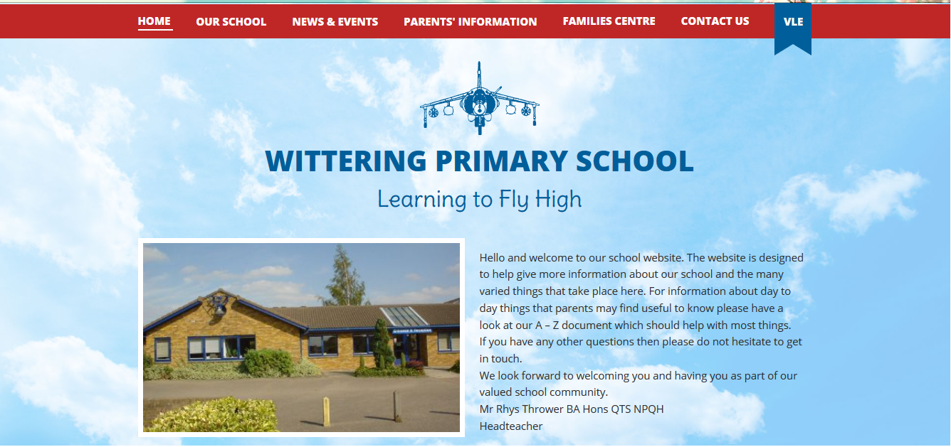
When first looking at this website I thought the design was rather simple, although it fits with the theme of the school and their motto. The sky background represents ‘Learning to Fly High’, since the school is based on the relationship they have with the RAF base, since most of the children at the school are from military backgrounds. Although, they could have changed the logo colours from the dark blue to something which would stand out more against the light blue, as well as making more use of the space which they have, to make their home page more gripping, for example having pictures of the children or projects which have been done within the school. Although the font, is easily readable and the text is the main focus of the page. The website looks like it is from a template, although the school have made it their own, and therefore it is effective. The information is clearly displayed, and easily navigated, this means that parents are able to see the information that they want without scrolling through and getting lost within the website. The links all work, and there is also one to the school’s VLE, which I thought was incredibly useful, since parents and children will need to be able to access that on a regular basis. The school also has a linked twitter page, so that parents are able to see real time updates from the school, for example if there is a ‘snow day’ and the school needs to be shut.
Overall, I like this website. I like the simplicity of it and the ability to easily navigate and find the information that is needed, it doesn’t overcrowd or confuse the user with a range of different images, links or text. Although following the The Web Marketing Association’s criteria, it might not be one of the best websites ever to be published on the internet because of it’s simplicity, but it isn’t the worst.
The second school website I chose to look at was Lyneham Primary School.
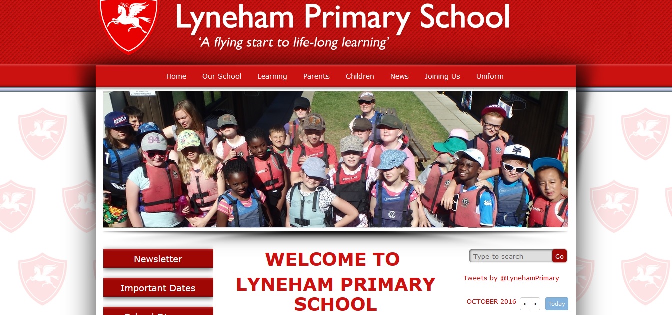
My first opinion of the website is that it is designed well, I like the idea of the school logo in the background, as well as the theme of red and white. The two colours compliment each other, and make it easier to read the white on the red. The text is also self-explanatory, which helps with the navigation of the website. Although the capital letters in the center of the page is a bit too big and the font could be changed to make it fit into the site a little more. I also like the incorporation of the images, the ‘Our Achievements’ tab and the school newsletter make the website more personal to the children. They’re able to show their parents what they have been doing in lessons, which helps to build the relationship between home and school. The website does look like it has been made from a template, although it has been personalised, which means it creates a more effective website, although it seems that a lot of schools follow a similar template. The content looks like it is updated often, the newsletter is the most recent copy, and there is a small calendar on the right which is updated with all of the events on throughout the month. I really like this idea since it, again, builds the relationship between home and school. I do feel that some of the pages could have more information on them, for example the ‘important dates’ tab only has the term dates on. The pages load quickly and all of the hyperlinks work well. This also helps the navigation of the website, although the only issue I had was that when I clicked on something it would open in a new tab or actually take over the website itself and not let me click back onto it, which could cause a problem for some parents who aren’t fully comfortable using the internet.
Overall, I think this website is okay. I believe there is room for improvement, although it is not the worst website online. I would ensure that all of the tabs have a good amount of information on them, and that there also is a range of media available online too. Although I think through the eyes of The Web Marketing Association’s criteria it might be a bad website because of the lack of diversity and interactivity.
The third website I looked at is Shrivenham CofE Primary School.
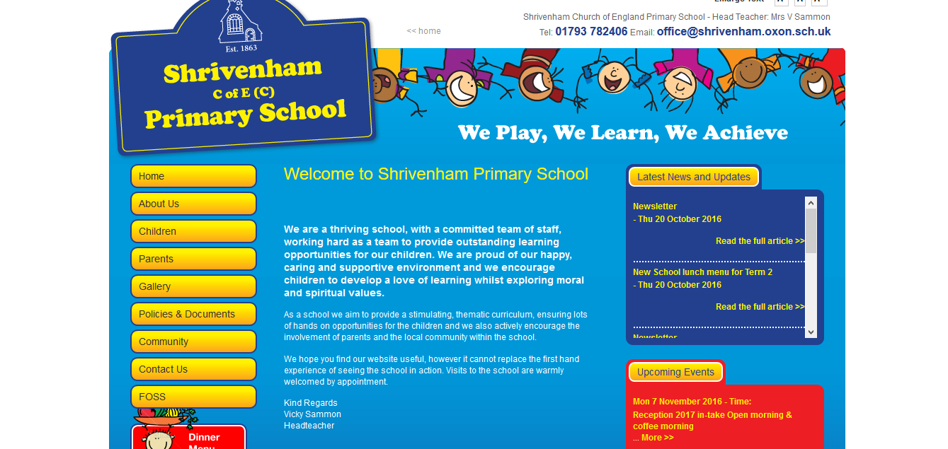
This website is fantastically designed. It is bright and friendly, I like the blue and the yellow as the colours compliment each other and draw attention to the navigation buttons on the site. The white text on the blue background also makes it easier to read, there is also an option to change the font side on the site to help make it more accessible to parents. Their school motto is also written across the center in white, which attracts the attention to it as soon as the website is loaded. I think this is the most effective website in regards to design because it’s not too simple and features a range of colours. I do think the website may have been created from a template, although the school have made it personal which makes is very effective. Although the school could have included an image on the front page to make it a little more personal. The content of the website is impressive, it has a break down of all of the classes and their plans, so that the parents are able to be included in the children’s learning and encourage or help them. The site also includes a gallery, which is updated very often, it shows the parents what the children have been doing, I really like this feature. All of the information that a parent or prospective parent would need in on the website, and I think that makes it a very good site. All of the pages and the hyperlinks work, which is really useful with a site that has a lot of features. The navigation of the website is simple and easy as everything is marked clearly, there is also obvious ways to get back from the pages that are clicked on to.
Overall, this is my favourite site and I think this one is the best out of the three. I really like the amount of information that is on the site and the gallery tab, a home to school relationship is incredibly important and it should be established through multiple mediums. I also really like the child friendly look of the website as well, it is a valuable resource for the school and paints them in a positive light. The Web Marketing Association would also agree, by their criteria of what makes a good website, that this website is a very good one.